A brand is more than a logo. You will have heard us at Fin (or any other branding agency for that matter) deliver this mantra whenever trying to make the point that a brand is, in fact, a complex construct combining many factors, and not just the colours, fonts and logos a business is using to advertise their products and services.
While this is certainly the case, it’s not the point I’m trying to make here. Instead, I’d like to talk about brands that have managed to establish memorable visual (or in some cases verbal) properties that make them unique and instantly recognisable even before you have spotted the logo sitting at the bottom of the page (or the top of the website).

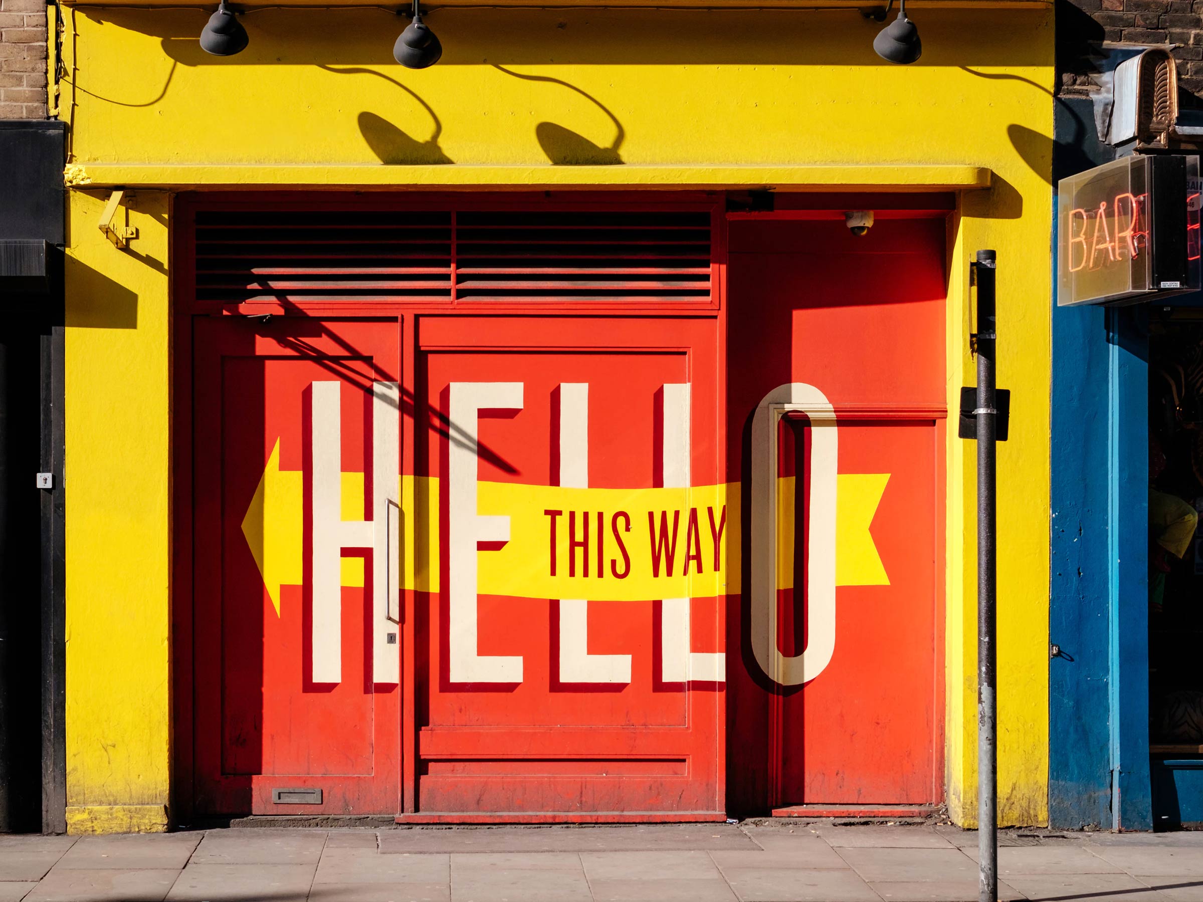
Elements from HSBC’s and Vodafone’s logos used as a supergraphic
Recently, it has become a bit of a trend to use elements of a brand’s logo and make it part of the messaging. Whether it’s HSBC using the interlocking triangles from their brand mark (which remains unchanged since it was first introduced in 1983) as a ‘supergraphic’ and make it the hero of their advertising campaign. Or Vodafone, who have freed the speech mark device from their logo to frame their marketing messages. Both companies (or more likely, their design agencies) have realised they are in possession of a well-established graphic device that can be made to work much harder than the logo ever could on its own.
There are brands, though, where their logos aren’t the first thing that comes to mind. Take Burberry, for example. Like a number of other fashion brands (Yves Saint Laurent, Balmain), Burberry has recently changed its logo to an almost generic-looking piece of sans-serif type. Not that too many people will have noticed, as what most of us associate with the brand is their iconic tartan pattern.

Burberry’s instantly recognisable iconic pattern
Adidas literally own the three stripes (like Burberry, they have trademarked the pattern) and will take legal action against anyone trying to use a similar design. As the stripes aren’t technically a logo, the company has managed to ‘brand’ their sportswear at events like the Olympic Games where other manufacturers couldn’t because of restrictions on the use of visible logos.
However, it’s not just fashion and clothing brands that have achieved almost instant recognition through design elements that are NOT their logo. For Absolut Vodka it’s the shape of the bottle (as, of course, it is for Coca-Cola). For O2 it’s the rising bubbles on a blue background that they, after all these years, still manage to integrate into every piece of advertising. Forget the Marlboro Man – as cigarette advertising, or even branded tobacco packaging, are now banned in many regions of the world, Marlboro seems to constantly find new ways to make use of its iconic red chevron device to great effect.

Subtle but effective: Marlboro’s stealth branding used on F1 racing cars
Arguably one of the most memorable things about IKEA is their approach to product naming. Innocent drinks became known for the chatty tone of voice used on their products and marketing materials. So much so that countless other brands across different sectors have tried to copy this approach to varying degrees of success.
How is this relevant in the investment industry, you may ask, where some asset management firms still consider branding, in general, to be a little more than a waste of time?
Our recent rebranding of Swedish investment managers IPM demonstrates how a distinctive set of brand colours, the use of white space and a unique approach to using photography add up to a visual style that not only communicates IPM’s brand positioning of ‘openness’ very effectively, it also makes for a distinctive visual language that is instantly recognisable. [view our case study here]

IPM’s unique approach to using photography
A solid brand positioning and clearly defined brand values makes a tangible difference in a competitive environment. Customers increasingly choose to invest with brands that clearly articulate who they are, what their product is, and what they stand for. This is the long-term benefit of building a visual identity that is more than just a logo.
When developing a new visual identity or refreshing an existing one, we put as much consideration into a distinctive photographic style, a differentiating tone of voice or a memorable graphic device, as we do in the development of the logo, colour palette and the choice of corporate fonts.
We look at a brand holistically and believe that a unique brand personality should be reflected in a brands overall visual identity – not just the logo.