A brand delivers its promise of defined expectations partly through its visual identity system spearheaded by the brand ‘logo’. These consistently placed visual signals and triggers are the prompts for the minds of the audiences to connect with their expectations of that brand.
But how many of these visual triggers within the logo are required to prompt the necessary on-brand response and understanding, and can these visual signals be manipulated to present a different position in the minds of the audiences? Or even to help make for easier branding?
I set out to explore how corporates, across a number of industries, have manipulated their logo to remain relevant to their audiences.
Bringing your brand closer to your audiences
Nestling quite firmly in the minds of some consumers is the perception that many large corporate bodies are actively manipulating the market through total control and in doing so creating less choice for consumers.
This negative perception may have originated from the book ‘No Logo’ by Naomi Klein in 1999, or to give the full name of the book ‘No Logo: Taking Aim at the Brand Bullies’! In the book she discusses the aims and consequences of aggressive commercial marketing, and the rise of the so-called “mega-brand” in the 1990s, and how companies began spending more money advertising their products than making quality items.
Whether as a direct result of the book’s text or through a need to get closer to their market a number of brands began to ‘talk’ directly to their consumers aiming to bring down the walls around the corporate giant and create a more human connection through what became known as ‘de-branding’.
You don’t get a bigger brand than Coca Cola, and in 2013 they took the hugely bold step to connect with their consumers by replacing its iconic name with 150 of the most popular names in the U.K. This move was replicated in Australia, the Middle East, and India, this was also referred to as ‘silent branding’.
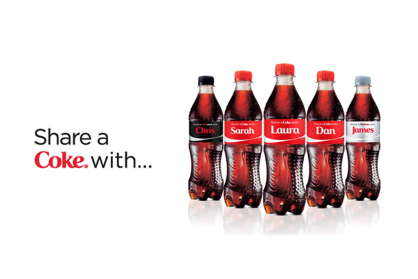
‘Share a Coke’ highlights the power of personalisation in branding.
Was it a success? It was a huge hit on ROI. It increased young adult consumption by 7%, earned the brand more than 18,300,000 media impressions, and boosted traffic to Coke’s Facebook page by 870% while growing page likes by 39%!
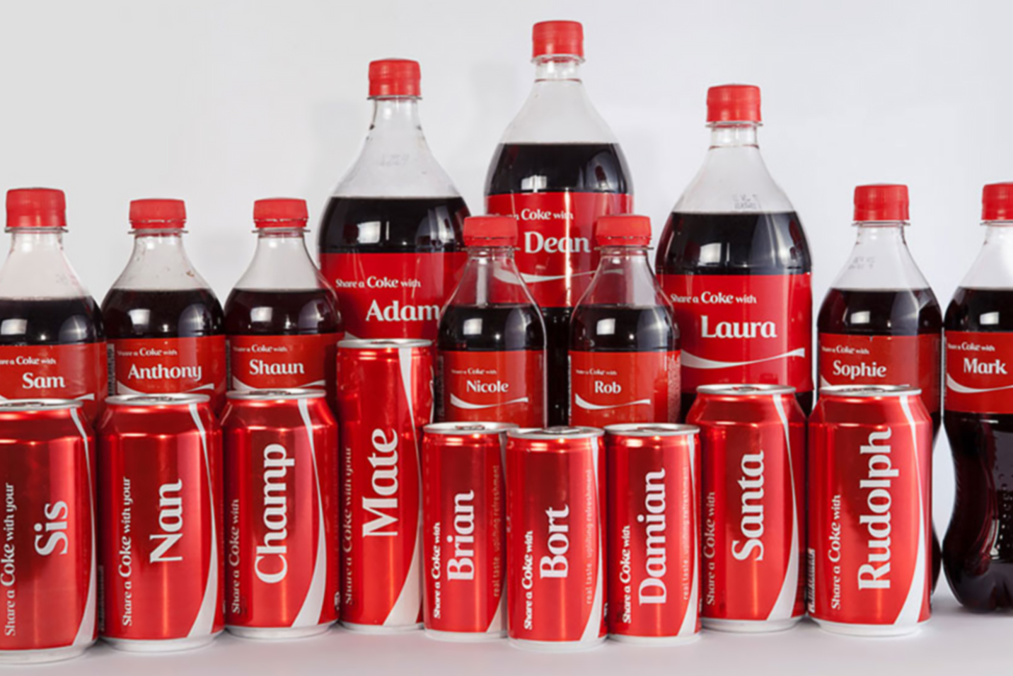
So Coke developed options to connect with its consumers through generic terms used in close relationships, such as ‘Sis’, ‘Mate’, ‘Nan’, etc.
Coca-Cola’s ‘Share a Coke’ campaign demonstrates the power of personal connection in branding.
Others did the same, that favourite for children on their toast or all over their face, Nutella, did a similar approach. In addition to the names, you could also choose from 5 labels to do dedications: ‘love’, ‘star’, ‘us’, ‘mom’, and ‘dad’.
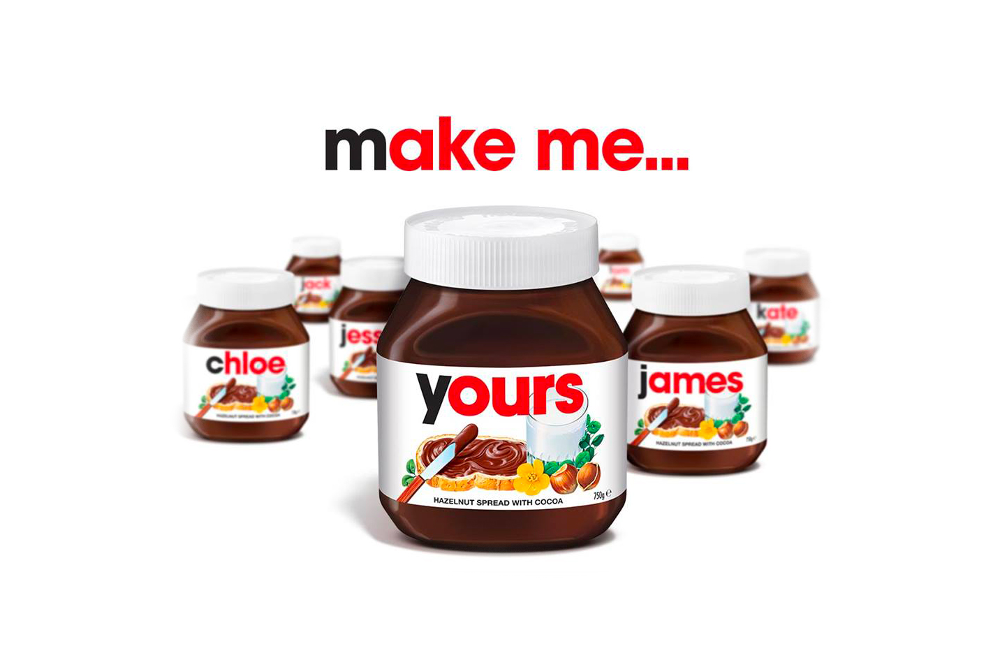
Custom Nutella Jars, part of their “make me” campaign
Starbucks have taken this one into point of sale by personally branding a coffee cup with your name.
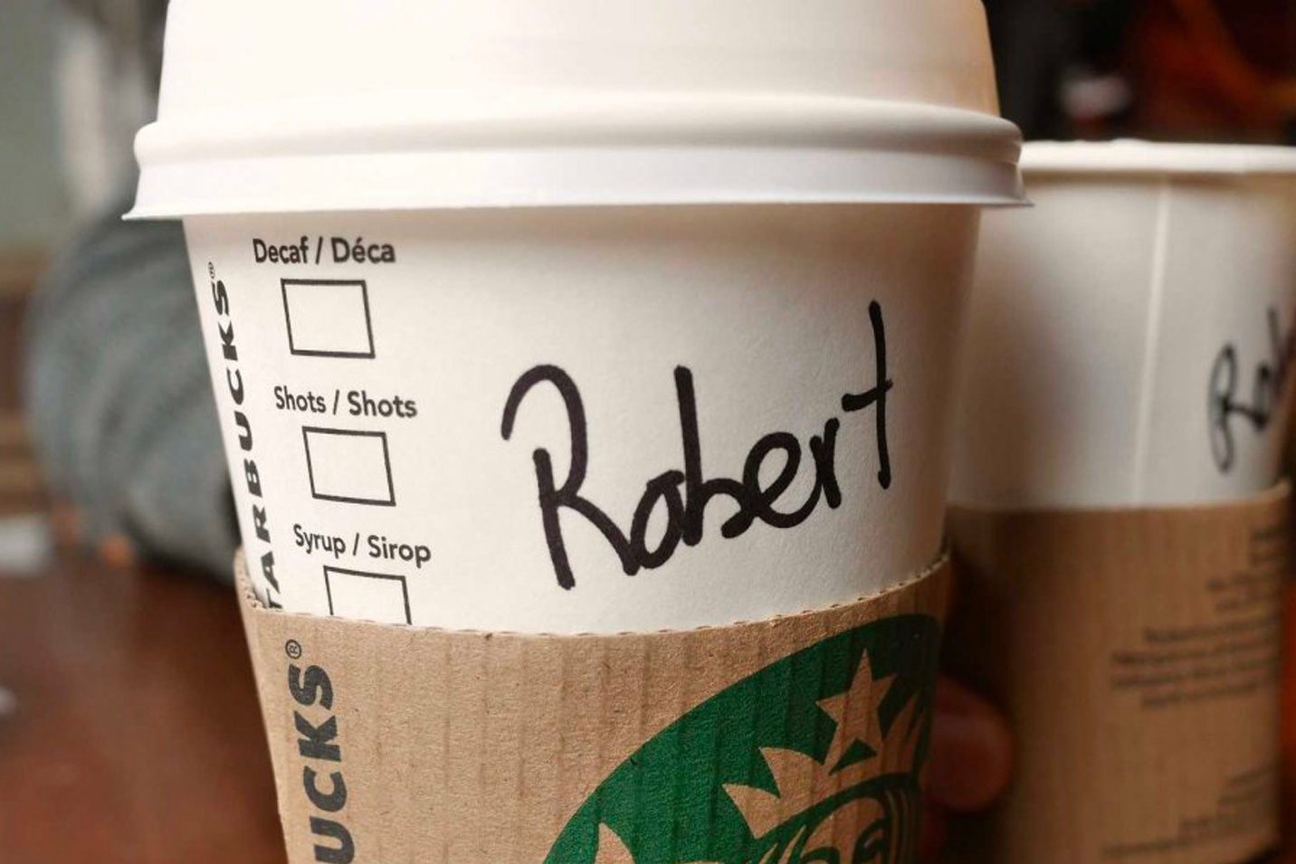
Starbucks personalises the coffee experience with handwritten customer names.
Words just get in the way
So, has less of the brand has resulted in more? By substituting the key component of the brand could connect the brand more closely with its consumers and even shift perception.
But there still seems to be the need to ensure the brand has a name. When brands are global this causes complexity as to what is the real brand logo, that which is in Latin based Western European or US English, or the brand as it is represented in, say, Japanese, a combination of logographic kani and syllabic kana.
Causing a headache of brand management to bring the brand close to its local consumers by talking to them in regional language. Again, referencing Coca Cola as possibly the most far-reaching brand across the globe and how it has translated it’s famous brand name into regional variations.

Does this clarify the brand name or create confusion?
The Arabic version of FedEx presents the colours and text as right to left, and can you spot the famous hidden secret in the FedEx logo also having been carried through but reflecting local cultural differences. This is FedEx brand to the local Arabic consumers but is it the FedEx brand to American consumers?

Another super-global brand, perhaps as ever present as Coke, is McDonalds, and you can see below how they have brought their brand to local consumers. The question is, is it McDonalds as you know it? Well this depends on your geographical perspective and from your local point of view, perhaps the McDonalds brand I see locally in the London high streets is equally a brand confusion to an Asian consumer when visiting London.

But what if you have only words in your brand logo.
Whilst many brands have a symbol to carry their brand message, many have only words which as discussed can require consideration to allow it to travel successfully.
A symbol along with the words will have helped in this localisation, as images could be seen as a near universal language seen in emojis being possibly the fastest growing language across the globe.
One route forward from a number of corporate brands has been to reduce the words to make it more colloquial and perhaps easier for the brand to travel, and in this section my perspective is localised from my geographical position of Western Europe.
The more formal articulation of the brand name which is potentially a bit of a mouthful to say, can be shortened to the more informal articulation of the brand name. As seen by the move from ‘The National Westminster Bank’ to the short form used by just about everyone who dealt with the bank of ‘NatWest’.

![]()
Even J.P. Morgan’s conservative and historical brand name has a shortened version for apps reflecting their global colloquial initials, albeit dictated by the lack of space, but recognising that even by three letterforms the brand remains intact.
![]()
When The Bank of New York merged with Mellon Financial Corporation, the outcome was much shorter than the combined nomenclature of The Bank of New York Mellon Financial Corporation.

Although, BNY Mellon is quite regularly shortened to ‘Bony M’ as we, the consumers, seek to short-hand the brand to create a closer and more ‘human’ engagement.
So, do words help or hinder a brand’s ability to present what it represents to its consumers?
Emoji branding
As I write this piece, today is World Emoji Day, celebrating the continuing use of emojis in communication through awarding the emoji Oscars.
The creation of emojis has become much more sophisticated than the classic ‘smiley’, with Apple today announcing new emojis to reflect the growing focus on diversity.

I’m using a phrase I’ve coined of ‘emoji branding’ to present another evolution of branding: that of removing all words denoting the name of the company from accompanying the symbol as part of the logo.
As seen above, emojis are now very sophisticated images and way beyond the early emojis using flat colour graphics. If I look at the definition of an emoji, it does in my opinion resonate with the objectives of a brand identity or brand logo: ‘an image or icon used to express an idea or emotion’.
Some big name brands could be seen as taking an emoji branding route to project their brand more globally and more quickly.
Starbucks now use only the Siren symbol.
Nike is only the Swoosh.
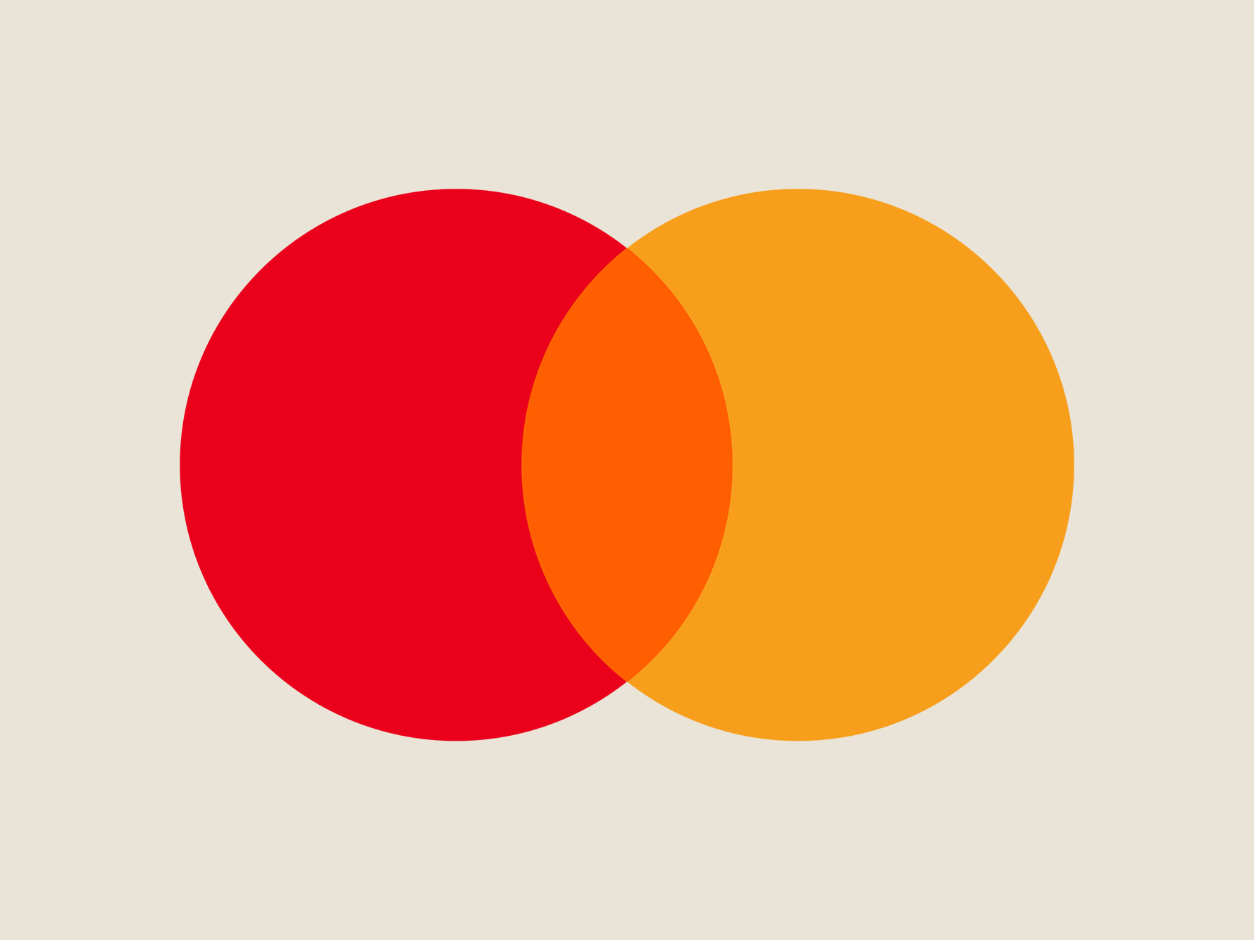
The Mastercard brand from 2019 is now only the circles.

McDonalds only use the Golden Arches.
Shell use only the shell.
HSBC have taken this to a whole new emoji level through building the graphical representation of the emotion or idea directly into their brand logo as an image place holder.

In this discussion on brand progression, the question arises is branding coming full circle in the use of pure symbols reflecting its origins as brand marques on cattle to denote the owners of the live-stock? Perhaps at that period when literacy was not very high, any words were of no help to identify the owner of the branded steer. Perhaps this is reflective of today when brands require a global solution and local language may dilute the universal brand?

Shell, as mentioned earlier, are now using only the graphical symbol and may be looking back at their inception and thinking we got our brand right at the outset, then got complex, and needed to go back to our roots?
![]()
Is to go emoji the future of brand strategy? De-branding has some very obvious benefits: removing possible barriers for a global brand manging complex issues of regional languages. Also, as shown, removal of a brand name opens up the brand for personalisation seeking to build a greater connection with its users. If we throw out the old corporate identity rule book that a logo must not be modified or adapted, then as HSBC has shown a concept or emotion can be implanted directly into the logo, creating a powerful resonance between idea and corporate.
A company name remains, but perhaps established brands and also newer brands can envisage a time when their brand name and brand icon are considered separate entities to create greater brand engagement. A point at which less may deliver more.
See how we can help your brand, contact j.mould@fininternational.com