The success
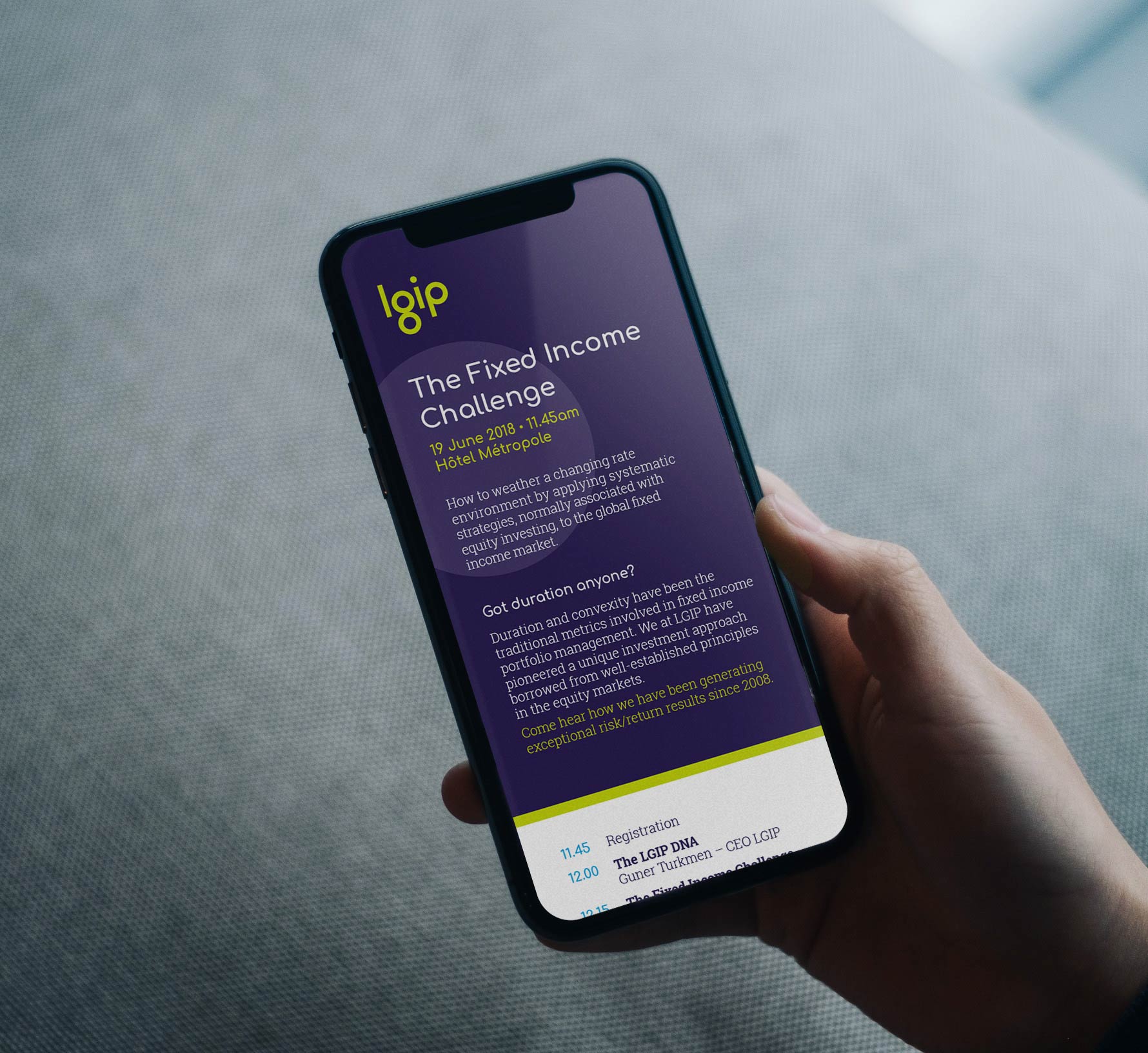
We wanted to highlight the reasons clients work with LGIP. This is best expressed by their philosophy and approach to trading, which we summed up with a simple, alliterative positioning statement: ‘Process Powered Performance’.
Their individual, and distinctive, investment philosophy seeks low market volatility through a systematic approach, partnered with opportunistic trading. This approach has been greatly appealing to Geneva’s private client market, who are looking for a robust methodology, guided by experienced insight.
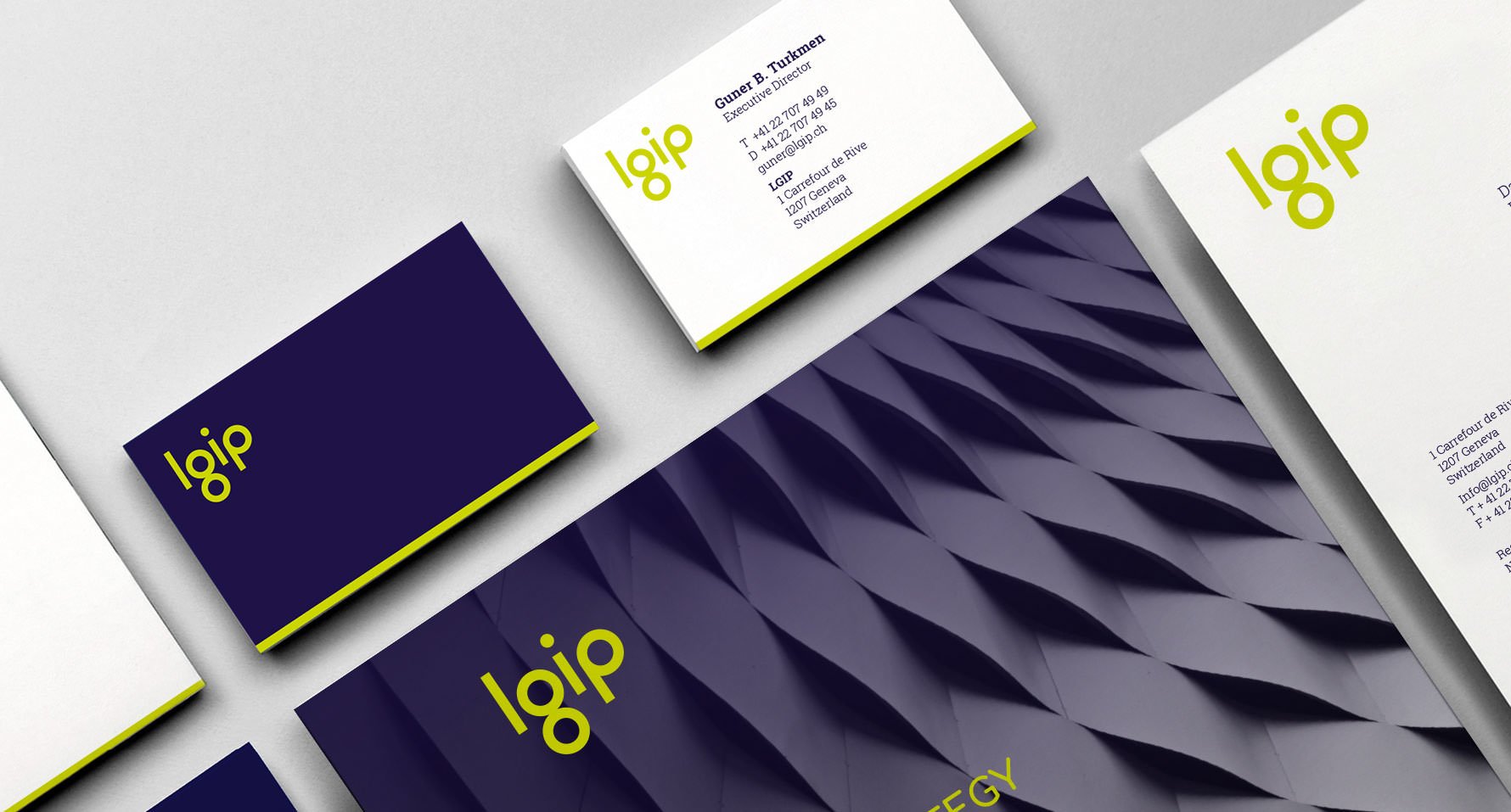
Also, it was immediately clear that the full-length company name, Lake Geneva Investment Partners, was rarely used. LGIP was already in use as the short-hand version. We just needed to make it more memorable.
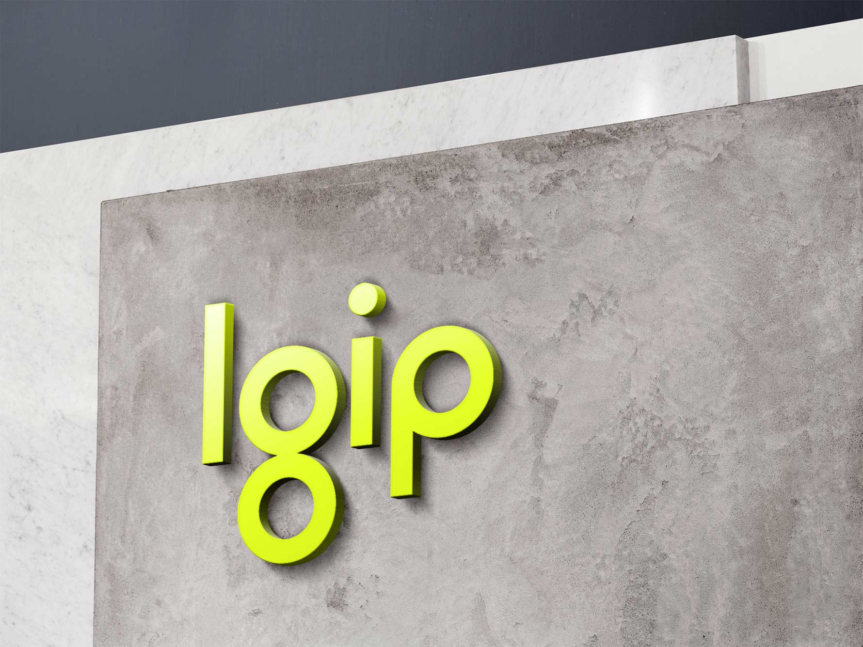
The initials LGIP replaced the full-length the brand name, presenting them as lowercase letterforms, to project a contemporary, forward-thinking feel and an approachable company (reflecting the people behind the brand).
The letterforms were simplified and stripped back to emphasise their shapes, turning the letters themselves into a memorable graphic icon. Through use across their branded collateral, and in other spaces such as corporate sponsorship, (like the side of a racing car), the shapes will become identifiable with the brand, regardless of the old name which they now represent.
See the LGIP microsite at www.lgip.ch