Europa was formed in 1995. Today, the firm has established itself as one of the pioneers of pan-European, cross border real estate investment. Across their investment strategies, Europa has completed 170 transactions, representing €13.4 billion, in 21 different European markets.
Europa
Creating a dynamic brand refresh for a UK-based real estate investment firm focused on Europe
The Challenge
Following retirement of the founding partners, the new senior management team wanted to send a to signal to clients and staff of a new era in Europa’s growth – or as it was initially called, Europa Capital.
Fin was appointed to develop a brand positioning to highlight Europa’s key proposition, to create a fresh and distinctive brand visual identity in support of the new brand positioning; a logo refresh; to rethink and develop a creative approach to client communications; and a totally new website.
Our Solution
We undertook internal senior stakeholder interviews, to understand the heritage of Europa as well as its future, and what it continues to deliver to its clients.
A review of key competitor brands was also undertaken to identify how each positioned themselves to ensure clear water for our brand positioning proposals.
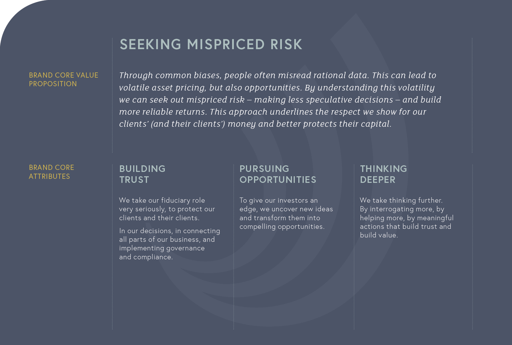
The insight phase provided us the content to shape our strategic brand positioning analysis. We presented a range of Value Propositions, each highlighting a key facet of Europa, with the supporting Brand Pillars underpinning and delivering the Value reposition.
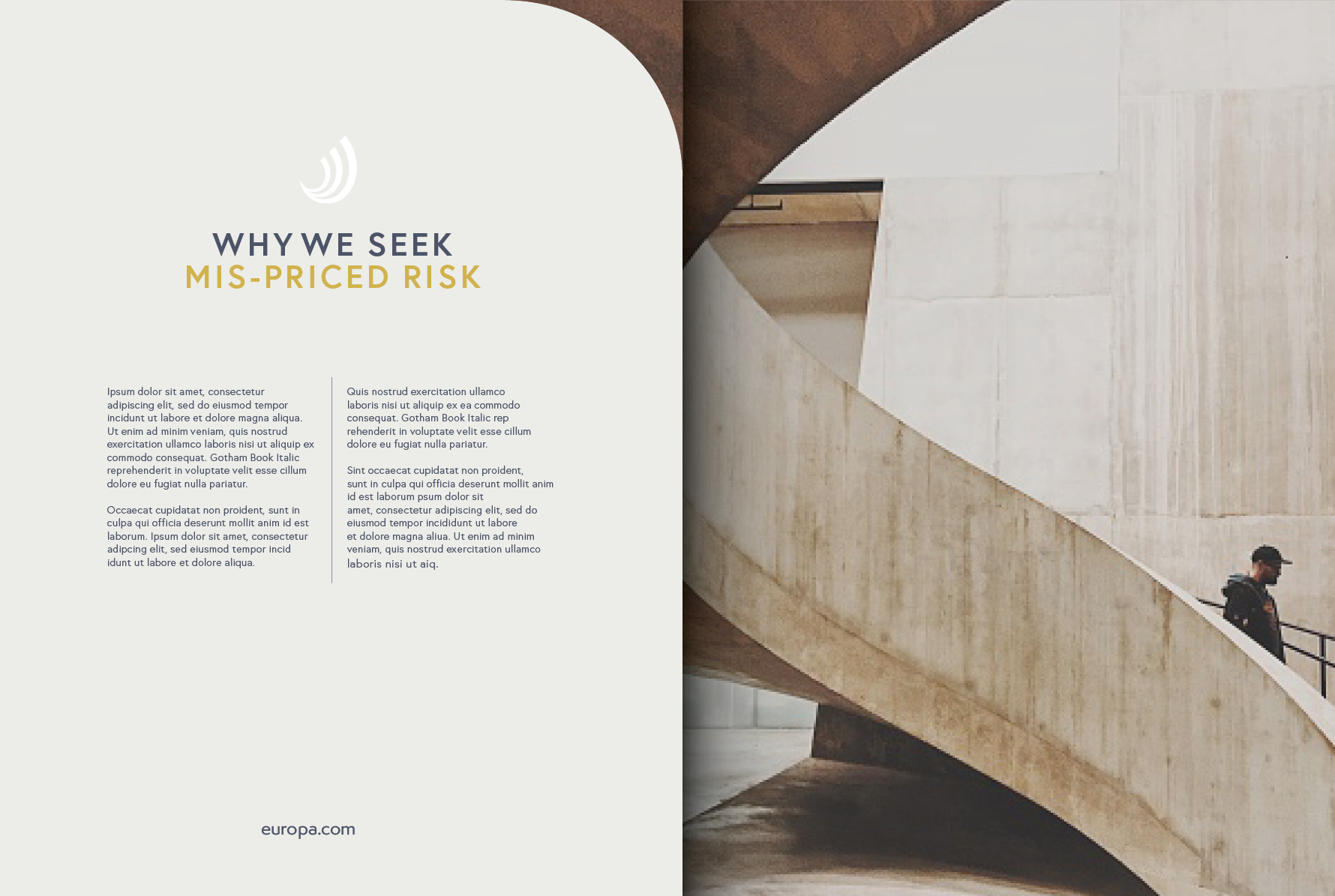
The core proposition was their history, and ongoing focus, of seeking mispriced risk in different markets, sectors and individual assets. A bottom-up approach, being neither sector or country specific.
We examined the existing logo and use of ‘Capital’ in their name. The logo had always heavily featured a graphic of a bull. However, the bull was considered inappropriate as connected to either an unpalatable Greek myth, or incorrectly associated with a headstrong and cavalier bull market.
We proposed to drop the use of ‘capital’ in Europa’s logo, and associated narratives, to avoid a clash with potentially being seen as a hedge fund, also in dropping the service descriptor would reflect the most commonly used title for the company.
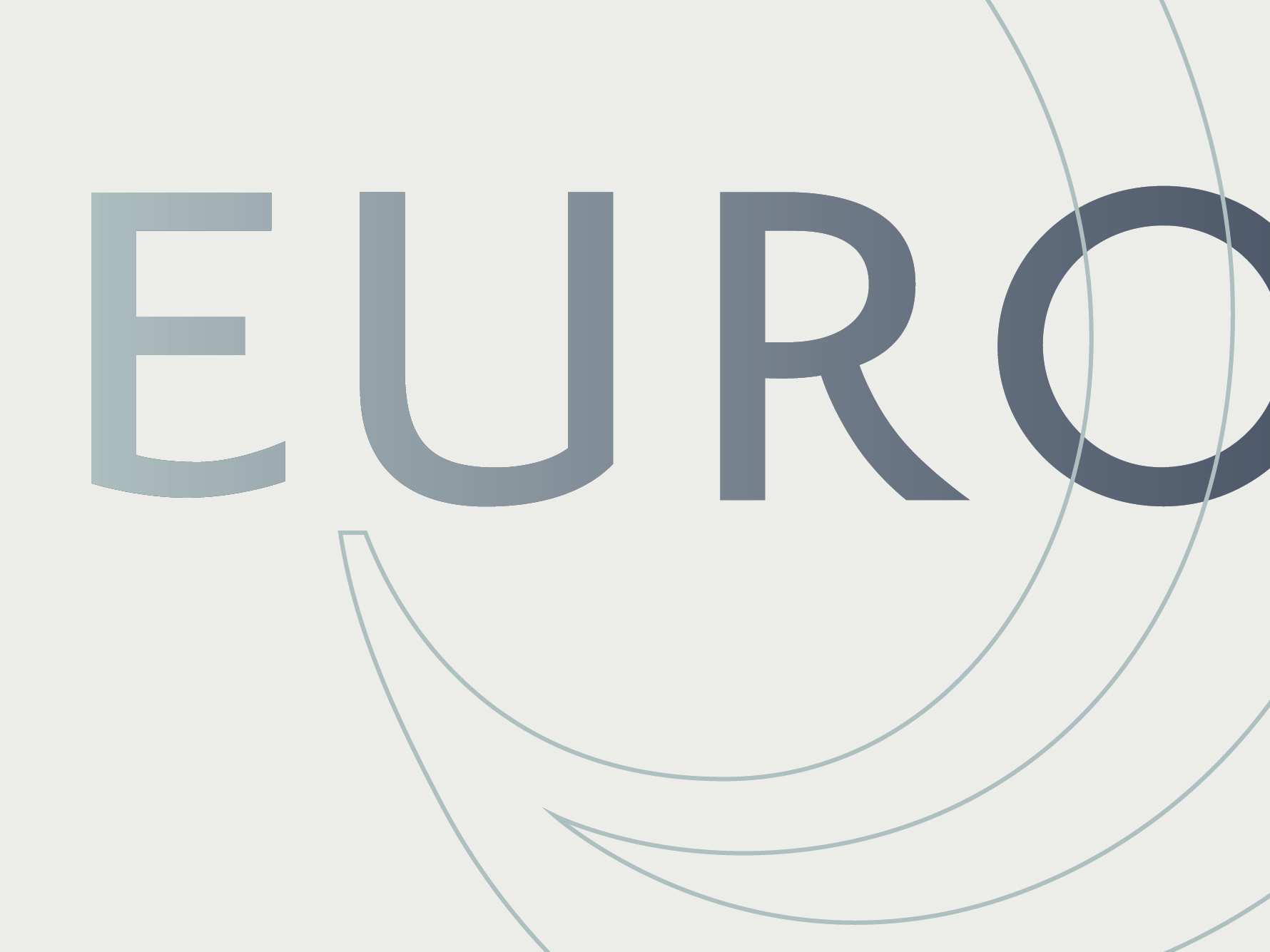
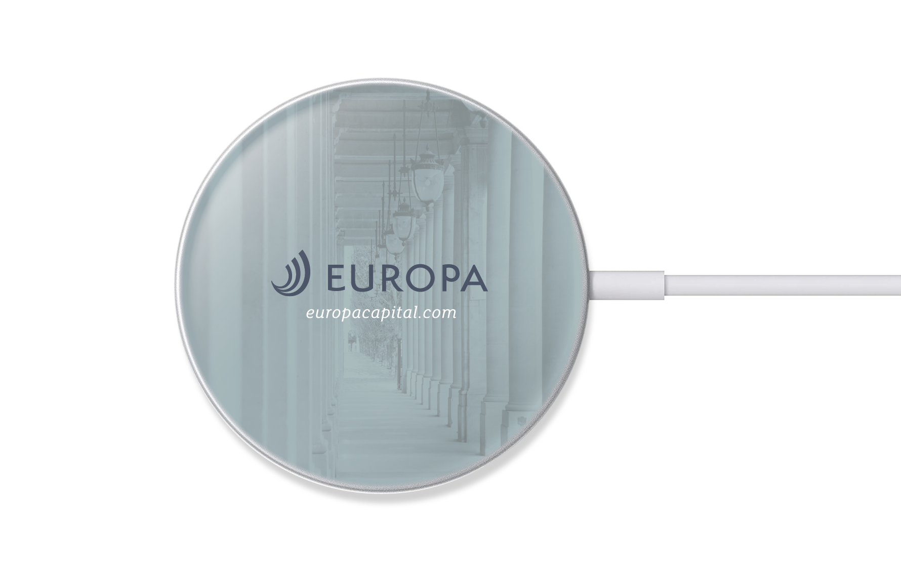
We created optional logos and visual identities to reflect the value proposition, from which an agreed direction was further evolved and finalised. The new logo quietly reflects the Golden Ratio – a symbol of continued growth – both in the letterforms and the symbol in the logo. The symbol became known as the ‘shield’, reflecting their protective nature as a fiduciary, their commitment to sustainablity, and the reassurance of a reliable supplier.
We created a fresh image styling for branded communications including a distinctive graphic device, again referencing the Golden Ratio, called the ‘Cornerstone’. This graphic device adds personality and distinction to the Europa brand and can be used to personalise a layout’s shape or to draw attention to content. We developed distinctive contemporary colour palettes and corporate typefaces.
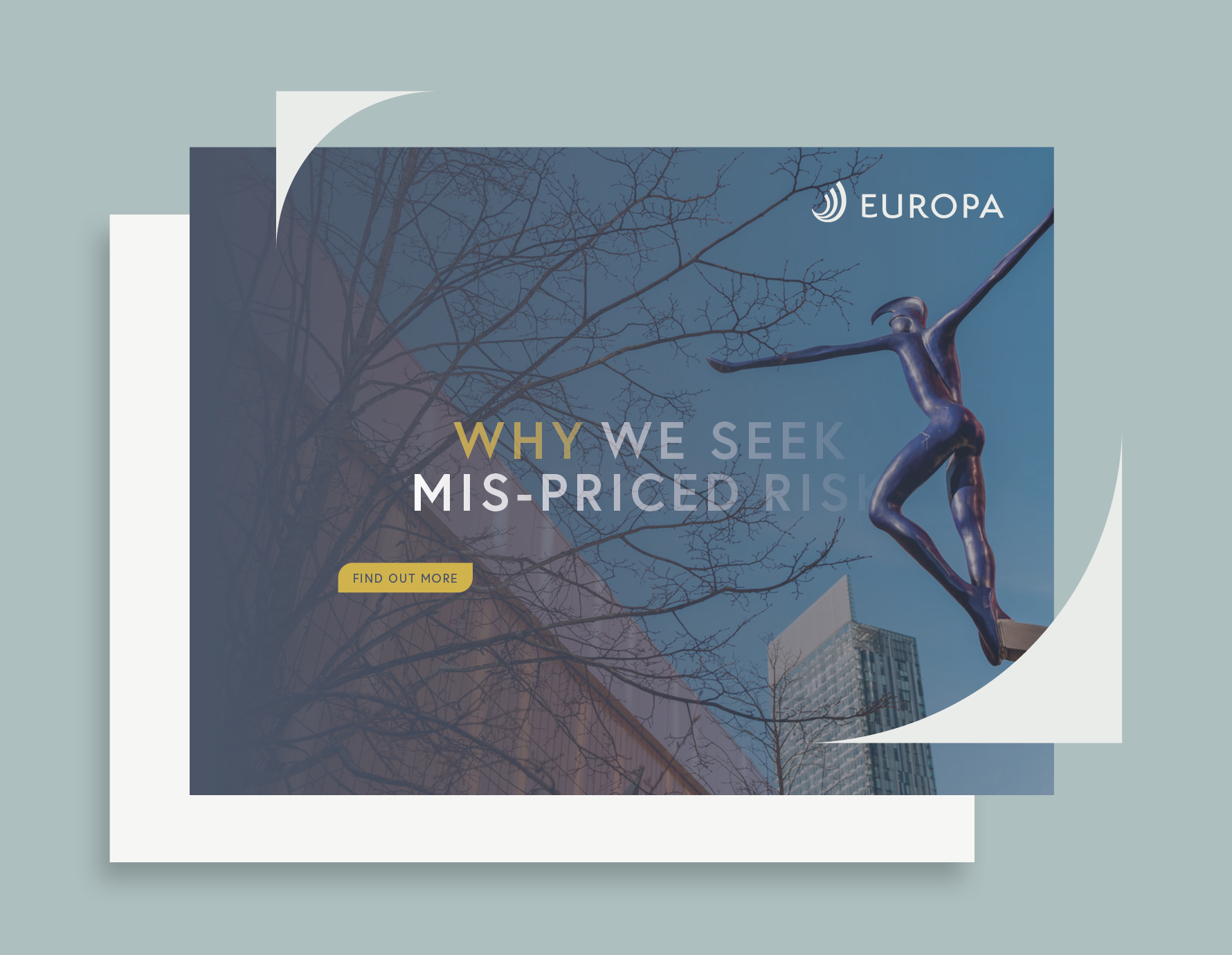
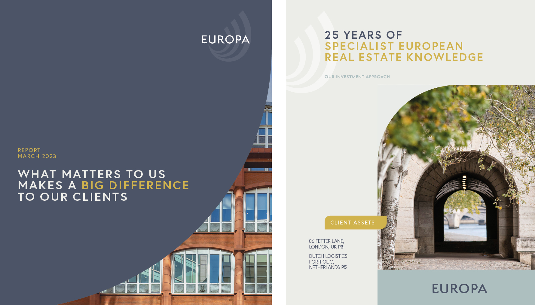
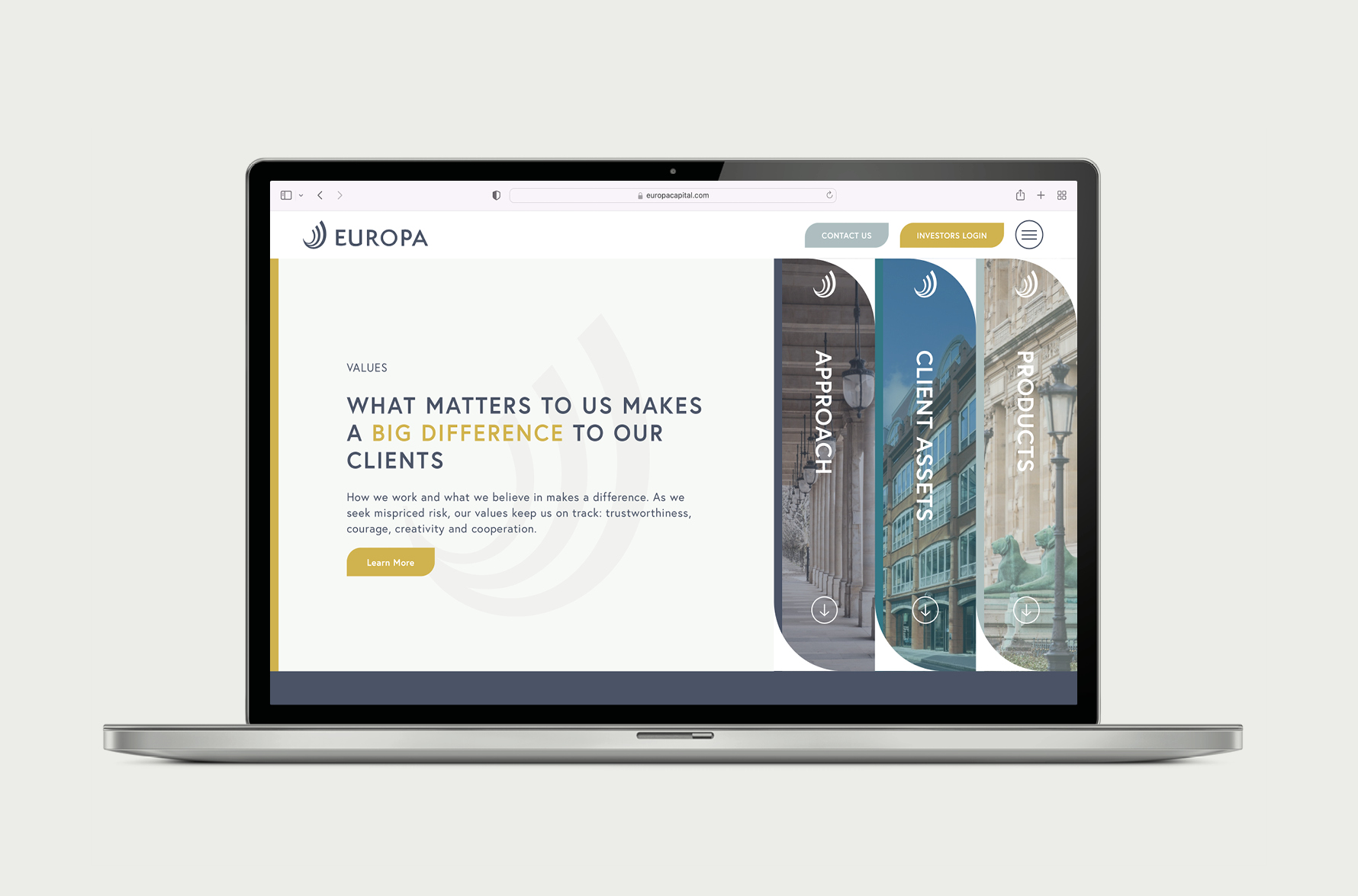
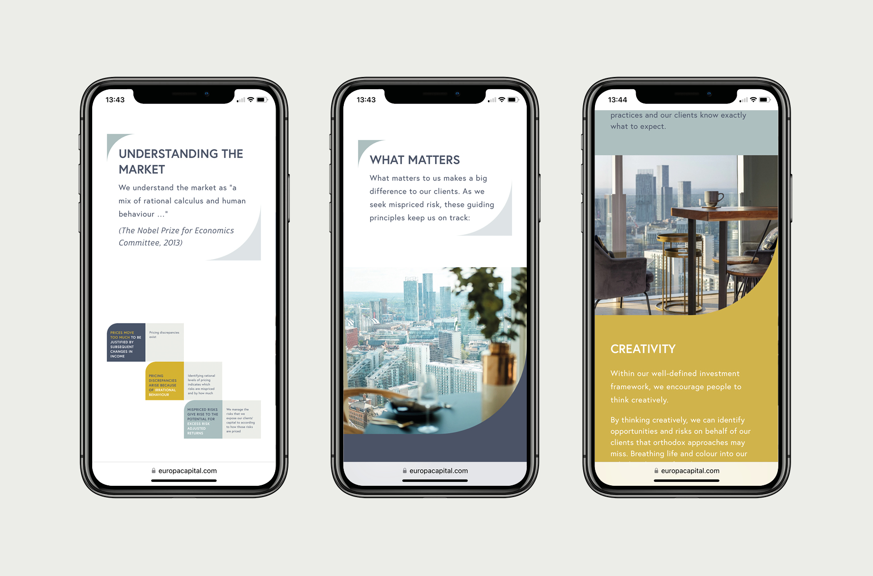
We worked closely with Europa’s marketing and senior management team on the refresh of their web site, to bring together all Fin’s brand positing and creative work. We designed, wrote, and built the website including a complete rethink of the UX and with the UI incorporating the new visual identity.
We produced a brand launch video to share the new brand at an exclusive launch event to clients and staff in London.
The Success
This project has been an important milestone in Europa’s evolution, not only because Fin created a contemporary and dynamic positioning and visual identity reflecting Europa’s true focus and personality. It was also a huge success in signalling Europa’s new and positive future to clients, prospects, and staff.
The new positioning, logo, visual identity, and website was launched, and positively received, to clients and staff at a celebratory evening at Sea Containers House in central London.
Explore Europa further at https://europacapital.com