Emso

A new identity for an established manager

Emso case study cover landscape

How do you create an independent brand and give a new meaning to an already established name?

The brief

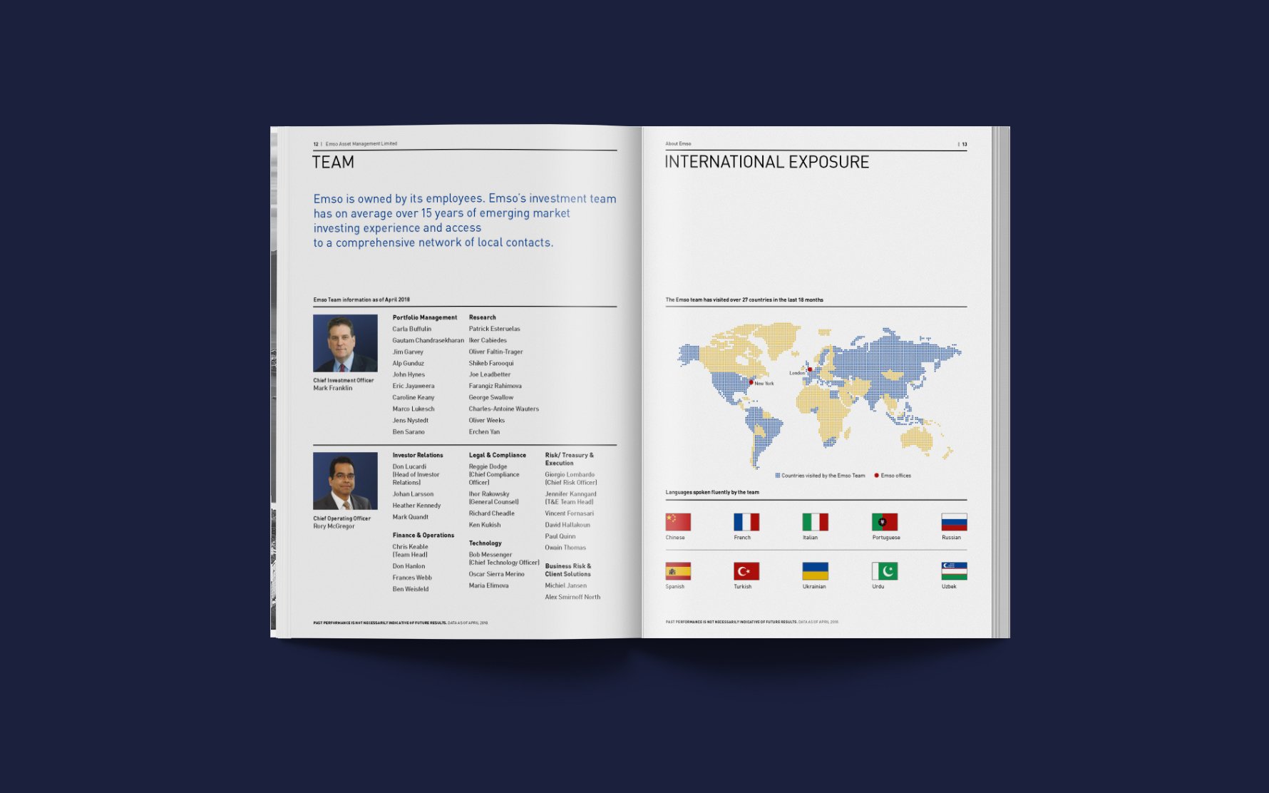
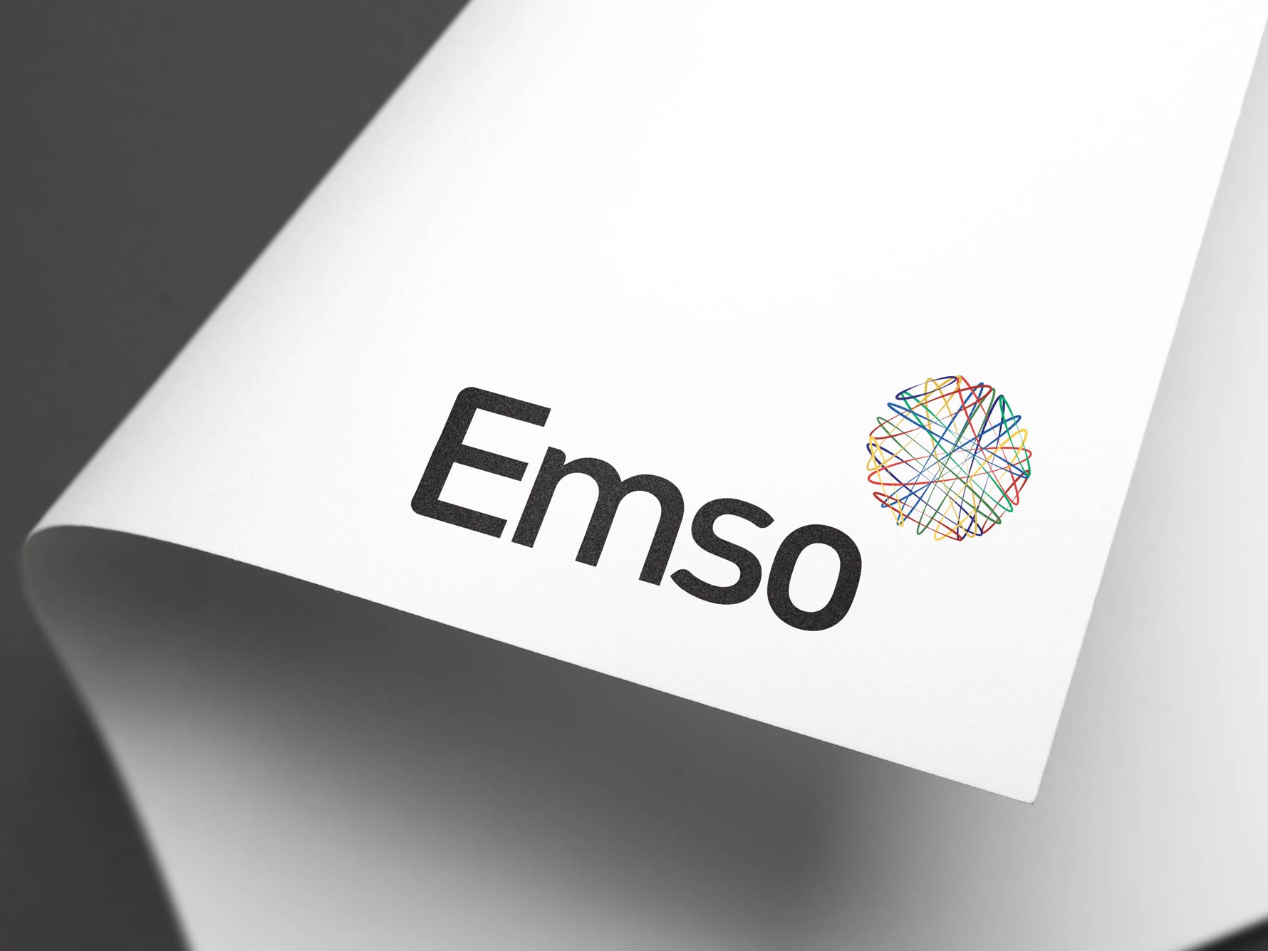
Following an employee buy-out at a multinational bank, an emerging markets focussed asset manager, Emerging Markets and Special Opportunities (“EMSO”, pronounced ‘em-so’), with $2bn AUM, came to us to create a new brand and identity.

The first requirement was to ensure they stood apart from their former parent company and found a way to turn the EMSO acronym, by which they were known, into a name in its own right.

The second challenge was to find a way to use the brand visuals to convey the meaning and purpose expressed in the old acronym through the brand’s visual identity.

04 EMSO FIN CASE STUDY

The response

To ensure we had a deep understanding of where the new company had come from, and where it wanted to be, we undertook extensive conversations with the key senior stakeholders, as well as a broad mix of our client’s clients.

Our in-depth analysis helped us to understand what is in the organisation’s DNA. Armed with this understanding, we identified what makes Emso stand out: a relentless pursuit of investment opportunity, an endless journey which takes them literally around the globe.

EMSO FIN CASE STUDY

The result

The acronym’s typography was reworked to give it a contemporary, modern feel and make it a proper noun. Now a standalone entity, the new name represented the new company’s name and identity, and was not just an explanation of the office’s function.

A sense of global exploration was captured in a new logomark. We developed an icon inspired by criss-crossing flight paths circumnavigating Earth, each flight path using a colour chosen from emerging market national flags. This icon became known as the Orbital.

The brand’s further visual identity grew out of our logo exploration. We created a brand toolkit and a set of MS Office templates to help the organisation create a strong separation between their old and new identities. The new templates enabled Emso to recreate all of their internal documentation in the new brand and create consistent client-facing communications.

EMSO FIN

The relationship

Over time, more aspects and products have been added to Emso’s suite; guidelines for the sourcing, use and treatment of brand imagery have been developed; a modern, magazine-style pitchbook produced and; a simple, templated monthly investor memo produced.

A former in-house entity is now able stand out in its own right.

EMSO project 2
EMSO project 3
EMSO project 4
Next project