Acolin is an independent, pan-European, cross-border fund distribution partner, providing compliant, smart and effective solutions for the distribution of collective investment schemes; enabling capital flows to move more freely across borders, and so helping clients to realise their growth plans.
Acolin
Refreshing the brand for a leading cross-border fund distribution company

The Challenge
Acolin was in a transformative life stage, having received capital input from a substantial private equity house, the acquisition of two service companies, and the introduction of new senior leaders.
Fin’s brief was to explore and develop a new brand positioning for who Acolin is and what it brings to its clients, and to create a new brand visual identity, both to encapsulate and project the company Acolin was to become, supporting its move forward towards new goals.
Our Solution
The project began with discovery; comprising internal and external senior stakeholder interviews, to understand who the refreshed Acolin is to be, how it will operate, and what it will deliver to its clients. We also undertook a workshop with senior members of the launch team to explore what the new spin-off would bring to clients.
A review of key competitor brands was also undertaken to identify how each positioned themselves.
This provided the insight to shape our strategic brand positioning analysis. A range of core propositions were presented to the ExCo for consensus, the agreed direction was then refined towards the brand core value proposition and the supporting attributes underpinning and delivering the value proposition.

Acolin connects clients to opportunities through independent thinking, partnerships, and trusted execution.
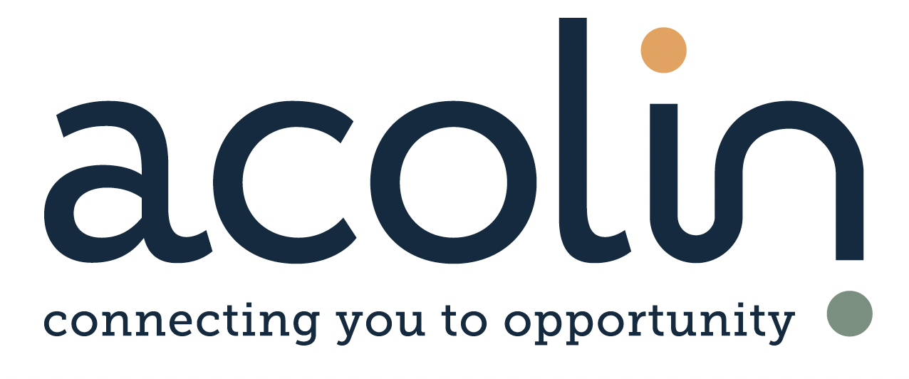
We created optional logos and visual identities to reflect the value proposition, from which an agreed direction was further evolved and finalised. The new logo presented a contemporary organisation and uses unique hand-drawn lowercase letterforms to reflect Acolin’s approachability. Using two highlight colours linking into the wider visual identity.
Acolin's refreshed branding emphasizes connecting clients to new opportunities with the linking of the dots
The new branded communications focused on the dots in the brand logo using abstract imagery of connectivity, a fresh but mature colour palette supported by a contemporary typefaces. The visual identity was taking into a website, photographic and graphic imagery, a visual brand signature, infographics, literature, digital templates, and tone of voice for copywriting.

Visual elements symbolizing Acolin's approach to connecting the dots in fund distribution.
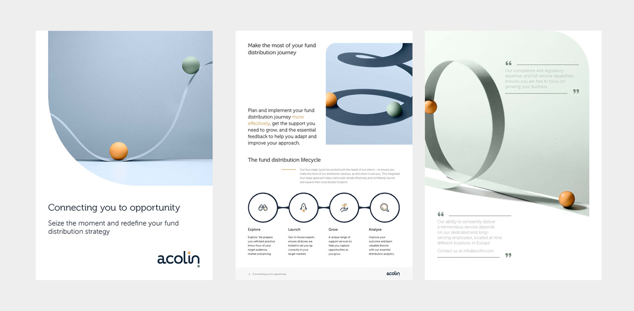
Highlights of Acolin's brand refresh, emphasizing the fund distribution lifecycle and connecting clients to opportunities.
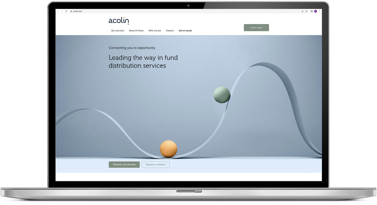
Acolin's refreshed website design emphasizes their leadership in fund distribution services and client-focused opportunities.
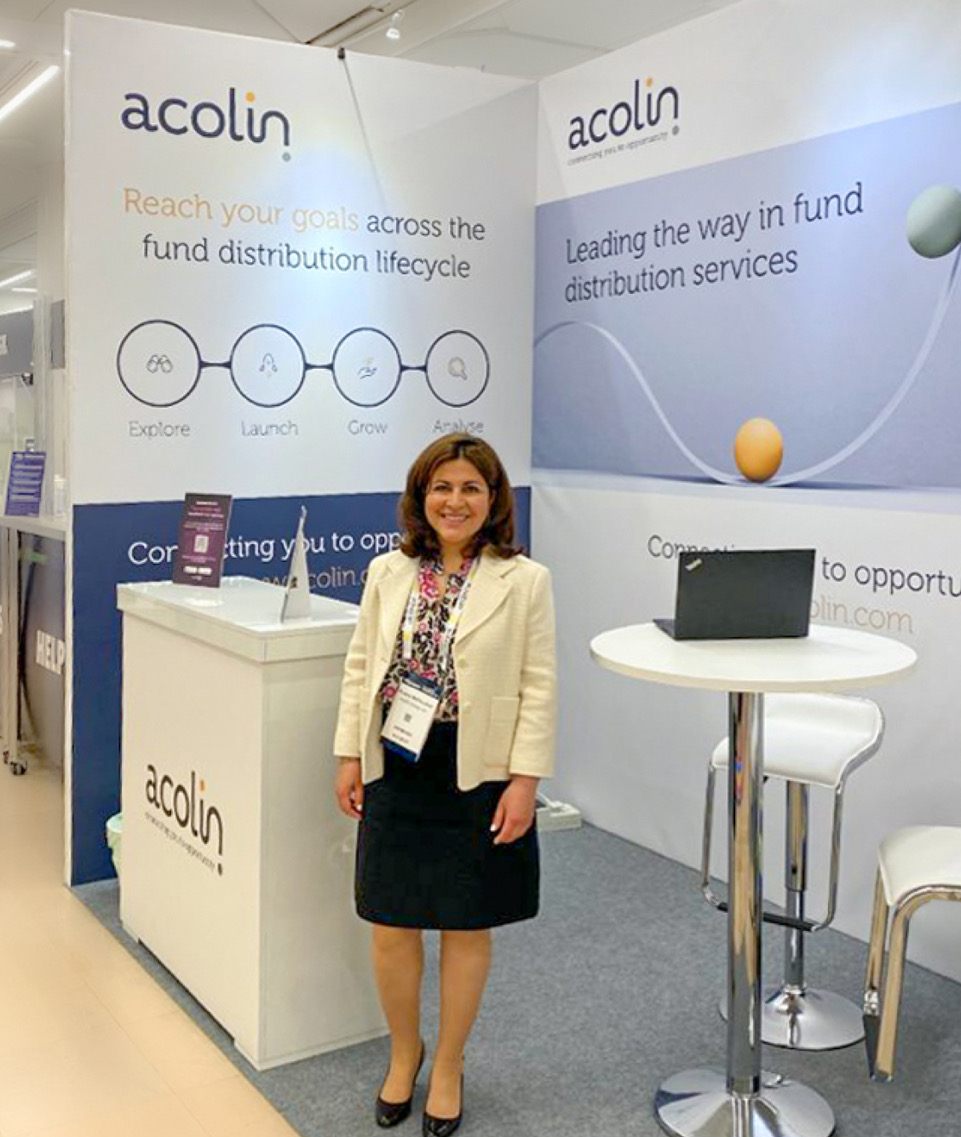
The Acolin booth at a conference, displaying refreshed visuals and messaging focused on connecting clients to opportunities.
The Success
This project was a huge success not just because we created a relevant and client focused brand proposition with a challenging and distinctive brand visual identity.
It was also a success because it was the result of a very close and trusting partnership that evolved between Fin’s and Acolin’s teams. This trust meant they were confident our strategic and creative propositions were right for Acolin we allowed us to push the boundaries of the project further than either of us had anticipated.
This was seen in the comment from Natznet Fremicael, Acolin’s Senior Marketing Manager: “Thanks to everyone at Fin for all the great work!”
Explore Acolin further at https://acolin.com