Fidelity International

What does sustainability look like?

FIDELITY_SUSTAINAIBLE_INVESTING_HAND_LANDSCAPE

The challenge

We were tasked with developing a creative theme to promote Fidelity’s Sustainable Funds Family’ (SFF), something which could grow and evolve with the offer.

Working to a tight timeline we developed a number of creative routes which could be quickly translated into a suite of static images to be used with an in-development brochure, and on the website, whilst building out the broader vision at the same time.

Our concept needed to represent the three pillars of the SFF framework, elevating the S and the G in ESG, focusing on diversity and collaboration at the expense of well-worn environmental cliches.

Rather than just jumping onto the moving ESG bandwagon, Fidelity wanted SFF to be perceived as a natural extension of what they have always been doing: making use of their superior research capabilities and their access ‘to influence corporate behaviours that will help build and protect investment returns’.

The approach

Any creative concept needed to afford flexibility in its execution, to accommodate roll out into a broad range of SFF collateral including advertising and video. The ideal concept would have the potential to develop images distinctive enough that they could be used as icons or identifiers for individual products and funds further down the line.

However, the imagery used would need to work for a broad European audience but a need for localisation should be assumed. A need raised because of the flexible nature of the word “sustainability” and its different connotations in different regions: northern Europe being likely to focus on environmental sustainability and southern Europe focused on financial sustainability and governance.

To meet the challenge, we produced a system that combined several images to give a sense of story. Aiming for a fluid and flexible system that could take off-the-shelf assets and turn them into something distinctive and ownable, that could be as sophisticated, or cliched, as the client’s brief demanded.

The outcome

We took direct inspiration for the three pillars of the proposition, integration, engagement, and sustainability, to construct a system that embodied those attributes.


Each of the SFF pillars imply a connection or conjunction between two elements: integration of the sustainable enterprise and Fidelity’s approach to investing, engagement between Fidelity and the companies in which the funds are invested – and collaboration between client companies and Fidelity while intelligently directing the sustainable approach.

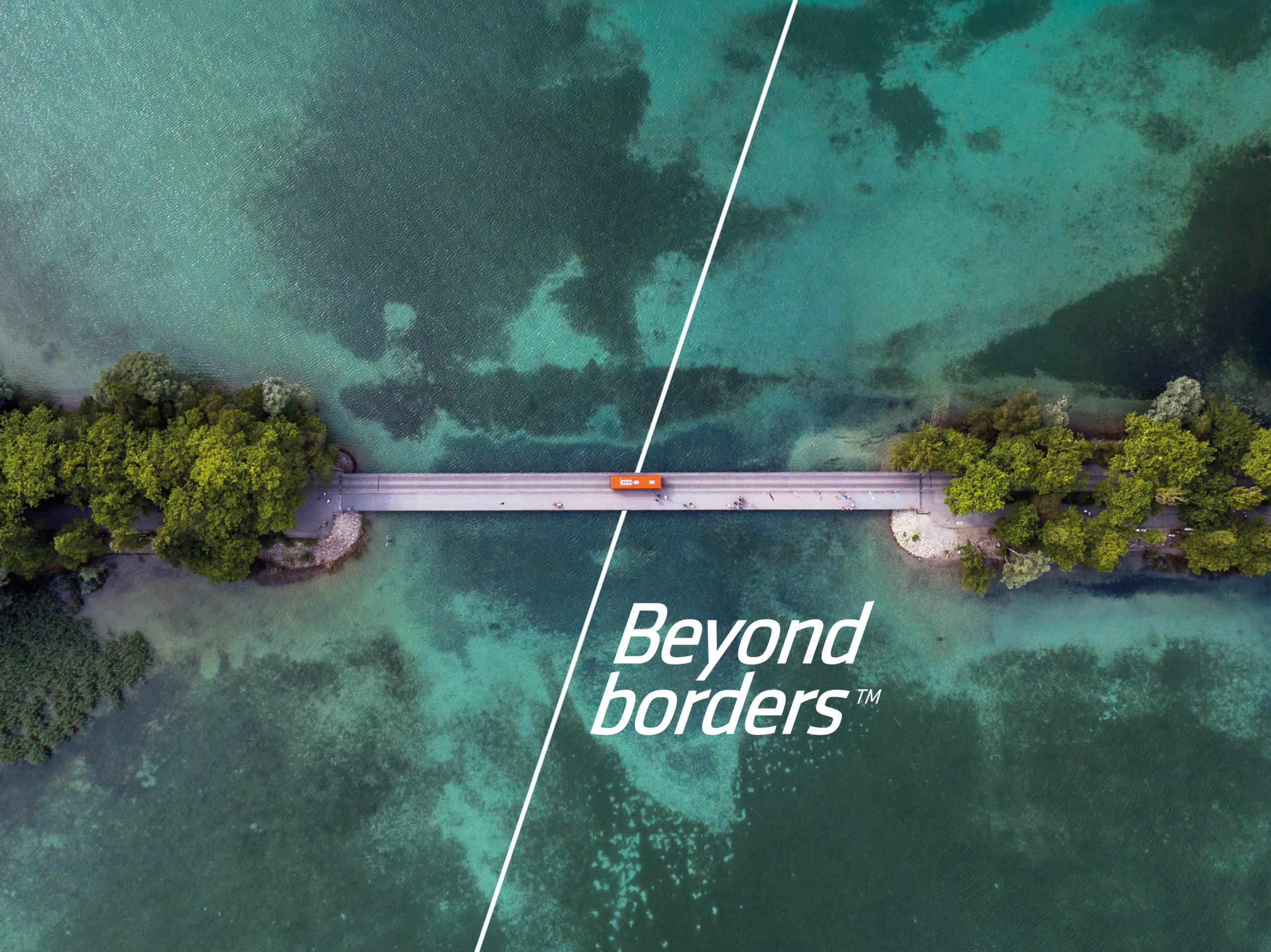
Our idea was to develop a system for creating composite images, always using three elements to echo the underpinning philosophy. The juxtaposition of different elements would enable us to present several faces and offer a sense of story rather than focusing on a single product attribute.

To this end, we found container images that could be used to present the composited images within. In this way, there is the potential to create specific stand-out heroes, as well as higher-level or more generic expressions.

Local markets would be able to work with the concept’s system to produce imagery with their own local emphasis, or even adapt the artwork to produce alternative versions of the existing composites to best suit the medium.

The system we developed to underpin the creative concept enables the resulting creative to be reformed and adapted to work in any collateral, a process that grows more efficient with each iteration.


To see how we can help out, contact j.mould@fininternational.com

Next project